
Day 31 of 50 Days of Python: Data Visualisation with Matplotlib
Part of Week 5: Data Analysis and Visualisation

Hello again, and welcome to Day 31! We’ll be covering matplotlib and how to generate different visualisations as well as how to customise them with different colours. This is a good lesson as it helps you understand the ins and outs of what matplotlib is capable of.
Python Setup
We did cover this in our last lesson but just incase, you can install matplotlib with this line of code:
pip install matplotlibChoosing the Right Visualisation
Different datasets require different visualisation techniques. Here’s a quick guide for choosing the right one:
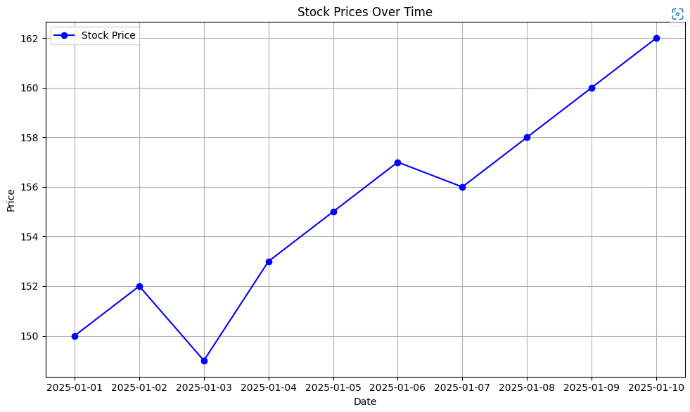
Time Series Data
Plot types: Line and area
Imagine you want to visualise stock prices over time, a line chart can perfectly show this.
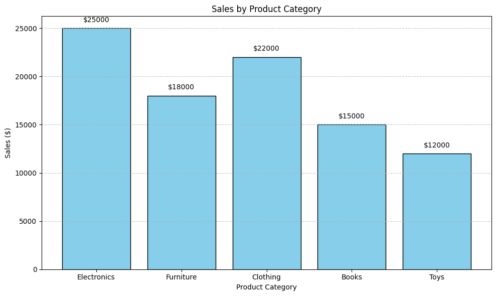
Categorical Comparison
Plot types: Bar and Horizontal Bar
A great way to show sales by product category or subcategory
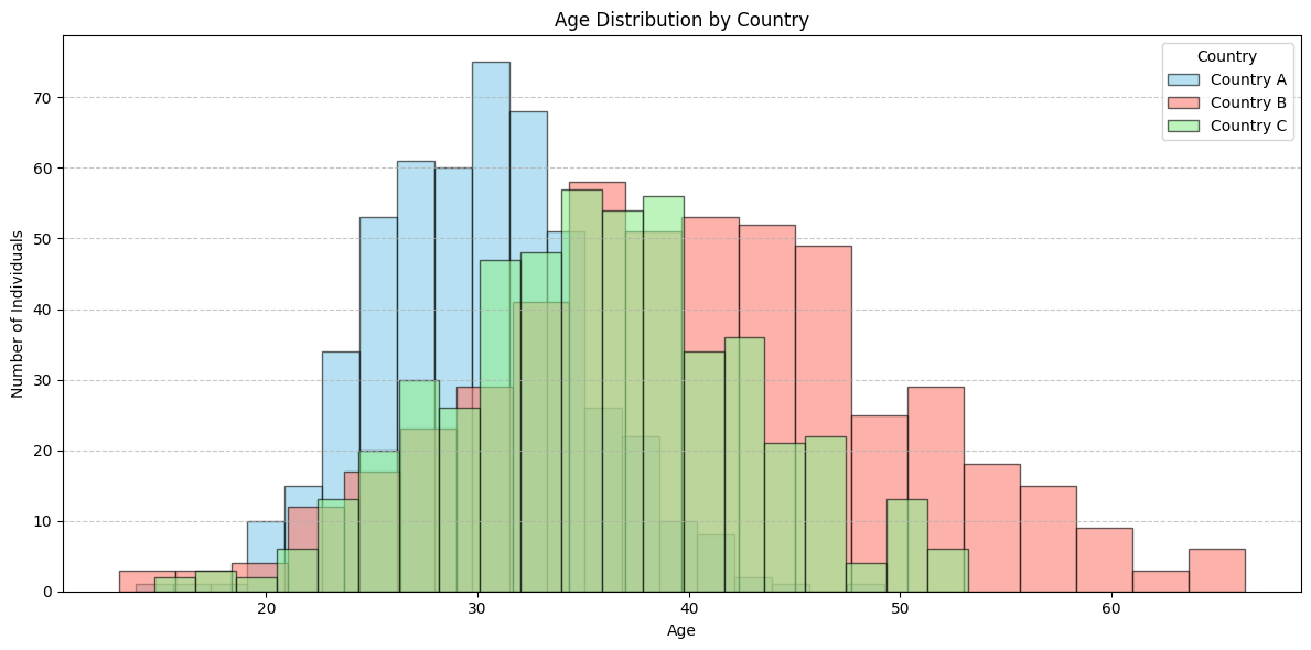
Distribution
Plot types: Histogram, box, violin
Lets say you want to visualise age distrubtion of a population by country, county or city. These plots are great for showing this.
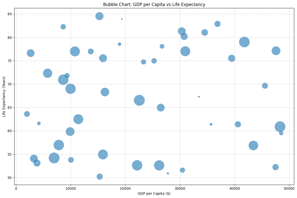
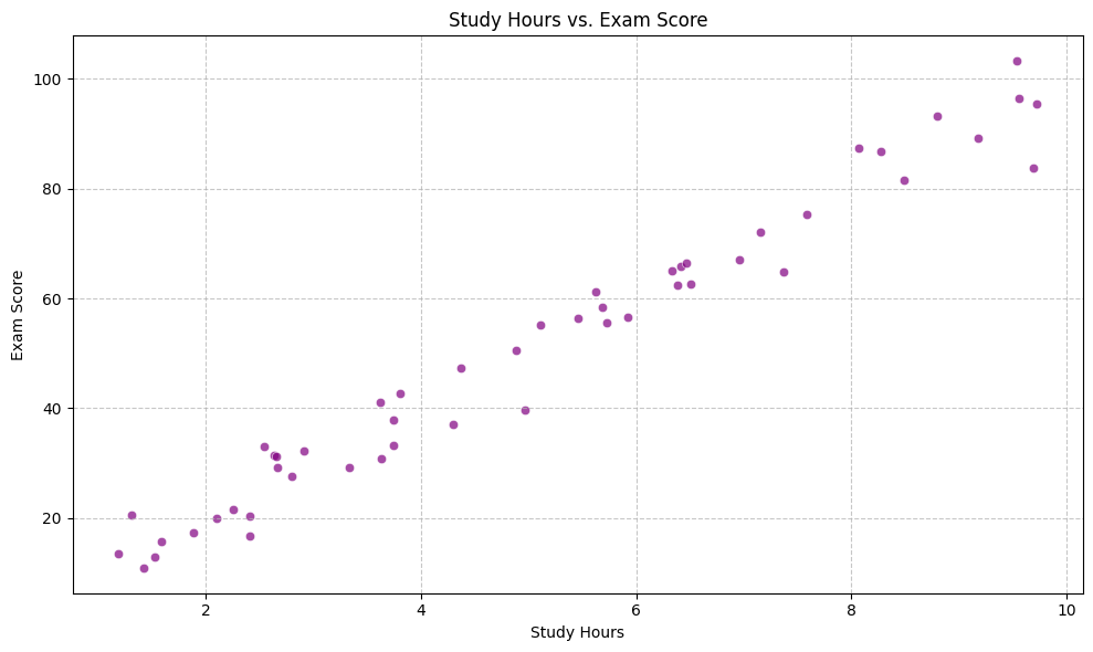
Relationship Between Variables
Plot types: Scatter, bubble, Pair
Top choices for visualising data like the correlation between spend and sales.
Proportional Data
Plot types: Scatter and Stacked Bar
Market share distribution is a good example of when to use these plots.
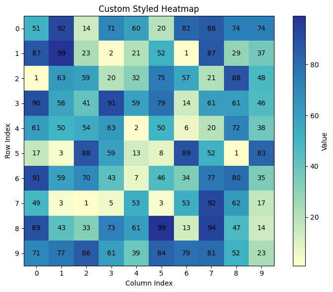
Geospatial Data
Plot types: Heatmap
Great for showing population density across regions. I’m sure we’ve all seen a fair few of these especially back in school.
Customising Your Plots
Matplotlib offers extensive customization options to enhance the clarity and appeal of your visualizations.
Colour Customisation
Specify colours using various formats:
Named Colours:
'red','blue', etc.Hexadecimal:
'#FF5733'RGB Tuple:
(0.1, 0.2, 0.5)Colormap:
'viridis','plasma', etc.
import matplotlib.pyplot as plt

# Line plot with customised colour
plt.plot([1, 2, 3, 4], [10, 20, 25, 30], color='skyblue')
plt.show()
If you’re after a list of colours to use, you can get this from matplotlib documentation here.
Colour Maps
Matplotlib also has a list of a few colour maps for different types of data.
Sequential: For ordered data (e.g.,
'Blues','Purples')Diverging: For data with a critical midpoint (e.g.,
'RdBu','PiYG')Qualitative: For categorical data (e.g.,
'Set1','Pastel1')
import numpy as np

# Create data
x = np.linspace(0, 10, 100)
y = np.sin(x)

# Scatter plot with colormap
plt.scatter(x, y, c=y, cmap='viridis')
plt.colorbar()  # Show color scale
plt.show()
Plot Styles
# Set style
plt.style.use('ggplot')

# Create plot
plt.plot([1, 2, 3, 4], [10, 20, 25, 30])
plt.show()
Again, depending on exactly what you’re after you can see what plot styles matplotlib has via their documentation here.
Next Up: Day 32 - Advanced Visualisation with Seaborn.
Since we’ve covered matplotlib it would be rude not to at least look at what seaborn is capable of. So Day 32 will follow the same format. we’ll cover what seaborn can do and maybe you’ll use that in place of matplotlib or even as well as.
Hope today has been informative, and as always… Happy coding!
